Aaron Heffernon is listed on Collapsing Horse's website as the designer, so I'm guessing he designed this simple and beautiful set, though as a collaborative project, I'm sure the members of the cast all had a hand in it.
The colours are stark rough white, contrasted with the performer's rich red 16th century style robes. Building on the theme of scholarly work, and the idea of a text being true to translation , but allowing space for each individual translator to bring their own interpretation on the text, the performers carry, use and rip up books through out the play. White boxes become seats, city walls, a city under construction and supports for a forest of branches.
Puppets, masks lengths of fabric and paper boats are used throughout the play. That's not new, but it's great to see such inventiveness back on the stage of an adult production. It's a production which is fun, despite raising interesting questions about how far a translator has the right to adapt a classic work, and what happens when you want to change the story?
Sightlines - set design blog
"Good design is all about making other designers feel like idiots because that idea wasn't theirs!"
Monday, 26 September 2016
A totally new design project
The House
Shortly after finishing Angels In The Park, I took on the project of renovating a derelict house. It has taken about 2 years, and is almost done. Time to start the garden.
 |
| The first thing to tackle was the garage. |
 |
| The original back |
 |
| Re-using the lawn from Angels In The Park |
 |
| Original bathroom decor |
 |
| New Shower and tiling |
 |
| Plenty to look at while having a bath. |
 |
| Once a dark living room |
 |
| now a bright kitchen |
 |
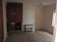
| old bedroom |
 |
| new Winter bedroom |
 |
| original living room |
 |
| now with added bear! |
Tuesday, 13 May 2014
Angels In The Park
Angels In The Park is a lunchtime performance of 4 10 minute plays, some new; some older- all written specifically for a park, directed by Aoibhinn Gilroy for Shiva Productions.
I've continued my interest in creating intimate settings where the audience feel part of the experience, creating a set which the audience experiences through all the senses- not just sight and sound, but smell and touch. Taste too- soup and sandwiches are included in the ticket price. My starting point for the set design was how people use parks- so picnic blankets are provided if you want to eat your sandwiches on the grass.
The play runs this week, at lunchtime until Thursday 15th May, at the Axis Ballymun. There are 8 plays altogether, with 2 cycles alternating each day. On Friday 16th, the performance will be in the evening, with all eight plays performed.
https://www.facebook.com/pages/Shiva-Productions/144944125524932?ref=photo
Thursday, 21 February 2013
Griswold review
Saturday, 9 June 2012
 |
| Ground Zero |
The play I'm working on at the moment (Griswold - Loose End, Civic Theatre Tallaght) is a black comedy set 4 months after 9/11, so I'm really enjoying the experience of designing for something I remember myself. As a starting point, I revisited some of the images of Ground Zero; they look like stage sets in themselves.
The Focus Theatre has had to leave its venue in Pembroke Place, so the detritus of ages was removed from the attic and found it's way back onto a stage. I also cannibalised the old set from Hen Night for the structure. It looks like chaos but it is actually tourable.
I've had fun with lighting with this set design, and I've enjoyed working with Colm Maher from Bewleys. He's created a lovely lighting design, unfortunately difficult to capture on camera. You'll have to see it in real life.
 |
| Set in progress |
Wednesday, 6 June 2012
Going Dark at Young Vic, London
Reviewers..
Why do so few critics ever mention the set of a show? Is it that they are for the most part trained as literary/drama critics and feel out of their depth when dealing with the visiual elements of a play? Or do they simply not notice? Here's the only one, out of all the reviews, that mentions the set of Hen Night.
Irish Theatre Magazine
Sonia Haccius’ set allows the cast use it as a proverbial
closet in which to hide their respective skeletons. Dominated by a painted
landscape scene that provides a backdrop so idyllic that it conjures up
memories of The Quiet Man, the greenery is
interrupted by a dingy hallway with greying wallpaper that allows the women to
disappear off to make tea and fetch sandwiches at alternate times, allowing for
secretive whisperings and interrupted conversations. A single bulb dangles from
the ceiling of the hallway, lighting various paraphernalia that have been left
behind by the house’s previous owners: a barbeque, a mattress, a child’s
tricycle.
by Sheena Madden
Reviewed 19 September
Subscribe to:
Comments (Atom)


.JPG)
.JPG)


